
Multiple Views of the Same Data Uncover Truths Theretofore Hidden Using Standard Methods
Why I Use So Many Different Views of Data

Standard methods, graphs, and datasets often obscure signals rather than highlight them. We humans tend to think in terms of human constructs such as calendar years and national borders. Diseases, microbes, viruses, pathogens have no concept of calendars or borders. This is why it is important to understand and view epidemiological phenomena from various viewpoints when investigating public health data in search of anomalies worthy of forensic investigation.
This article highlights one simple example of annualized data, where each bar represents a year of data, but one graph is a calendar year and the other is a fiscal year ending June of each year.
J18 is the ICD-10 Code for “Pneumonia, unspecified.” It is the category that dominates pneumonia-involved death records by a large margin and is a good indicator of seasonal deaths from pneumonia.
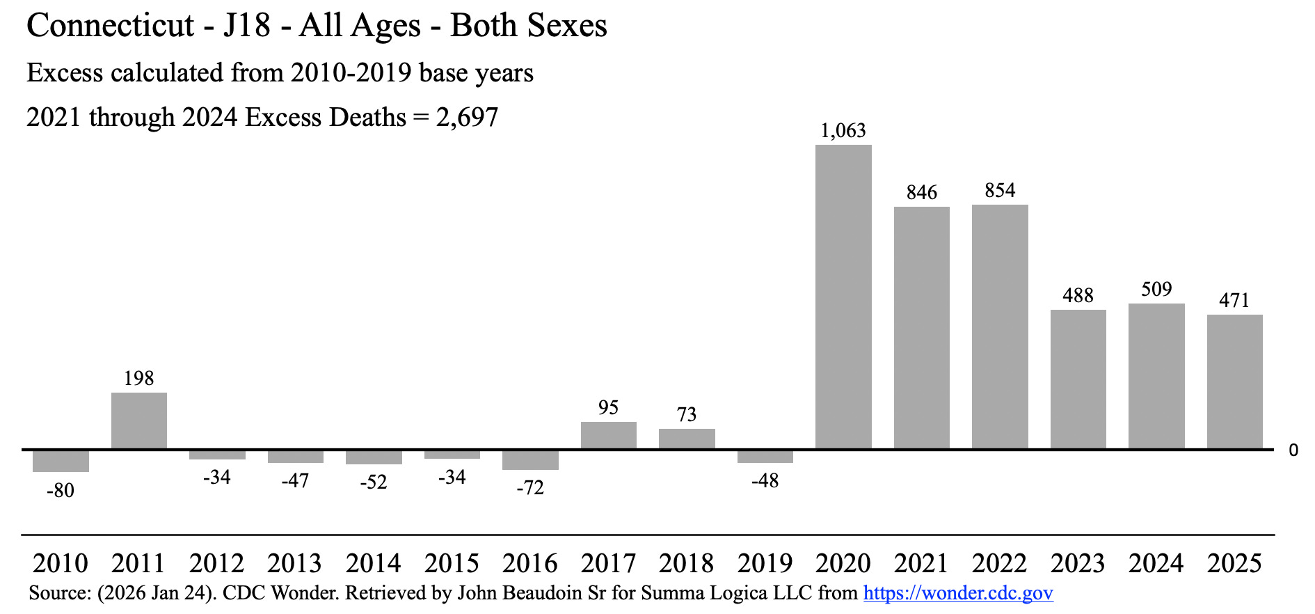
Figure 1
Figure 1 depicts 2020 to 2021 to diminish and 2021 to 2022 as roughly equal.
Seasonal respiratory viruses turn “on” in the winter and “off” in the summer. Covid clearly did that. If you consider that Covid first hit Connecticut, a northern climate with cold winters, in March, April, May of 2020, then you know that the entire first wave was only in 2020 and not in 2019. The second wave then began in November 2020 through February 2021. Thus, the calendar year graph in Figure 1 depicts one and a half waves in the 2020 bar (the entire 1st wave plus the first half of the 2nd wave). This is not a fair comparison to the 2021 bar, which contains the second half of the 2nd wave and the first half of the 3rd wave. In fact, this seems ridiculous.
How does the disease really look, in terms of pneumonia, from season to season, wave to wave, fiscal year to fiscal year?
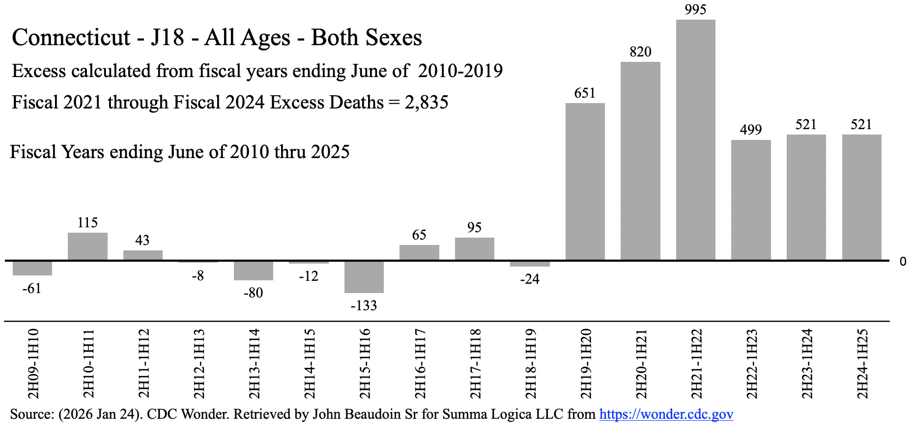
Figure 2
Figure 2 depicts the actual wave sizes year to year (id est, fiscal year to fiscal year). This is truth.
In this true depiction, if this is a disease, then why does it get worse for three consecutive years? Diseases do not take out all the dry tinder (unhealthy and old) and then come back around to kill more of the healthy people in subsequent years than it killed of unhealthy people in the first year.
One can make an excuse that the season turned off in the first wave before the heavy damage could be done. However, that does not excuse the third season of the disease being the worst as depicted in Figure 2.
Remember, of course, that this is pneumonia and not Covid per se.
Most Important Finding
Regardless of which graph you view in Figures 1 & 2, there is a continuing excess of ~500 deaths involving pneumonia for three consecutive years after the first three waves of Covid. Covid pretty much ended in March 2022, if you believe it was the disease that actually killed people (my opinion is that hospital Covid treatment protocols and Covid vaccines killed 10X more people than Covid did — and I can back that up with evidence). So, why is there continued excess after three seasons of Covid?
Here is a meme I posted on X and Facebook recently.
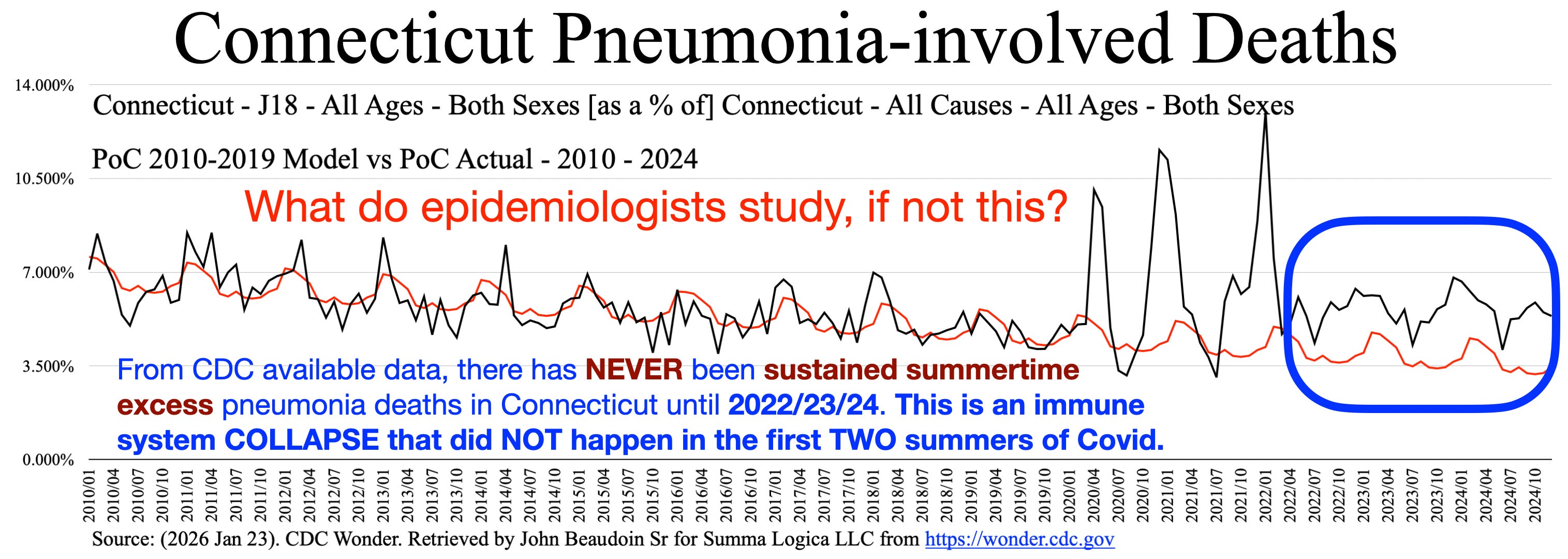
Figure 3
Please look to the right in the blue box in Figure 3. Notice that the red line model is far below actual (black line plot). The most important finding in this article and in that blue box is the summer time of those three consecutive years 2022-2024.
Adding 2025, just to see if it maintains excess for a fourth year in a row:
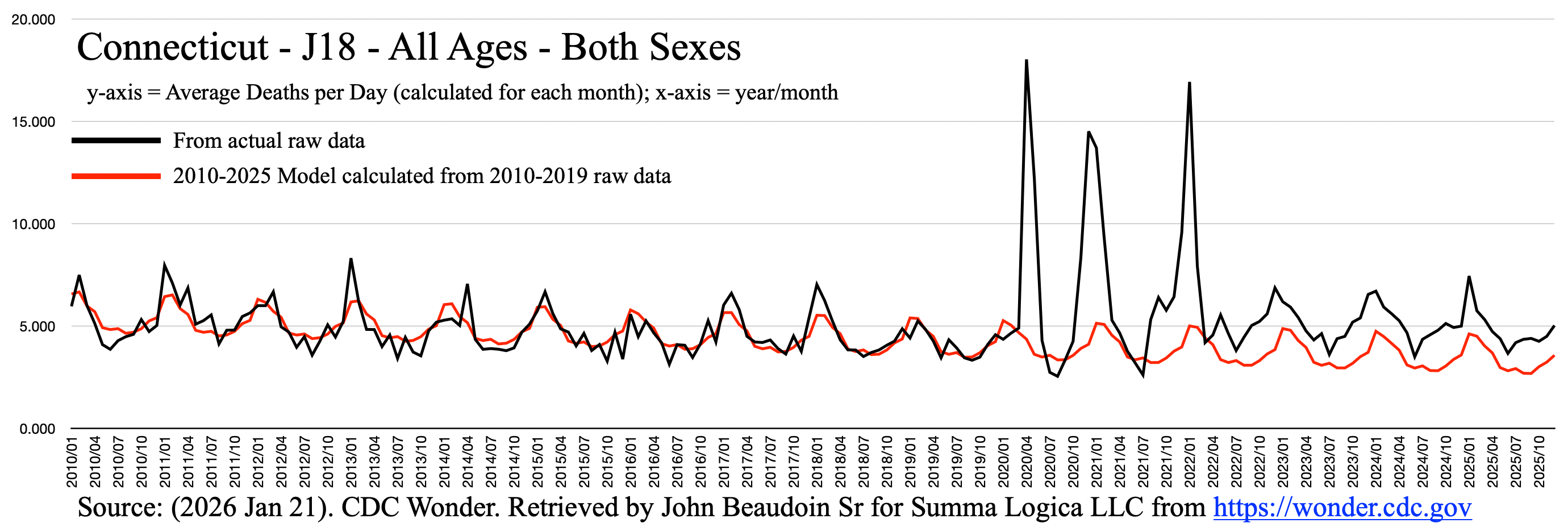
Figure 4
Figure 4 depicts the summer of 2025 to be a fourth consecutive year of excess summer pneumonia-involved deaths.
Look now at the summers of 2020 and 2021 after massive years of Covid disease and corresponding pneumonia deaths. The summers of 2020 and 2021 are BELOW expected values in the red model plot.
Most Covid vaccinations occurred in the end of summer 2021 due to vaccine mandates for school, corporations, hospitals, and government workers. After summer 2021, there were FOUR consecutive summers of excess pneumonia-involved deaths. Years 2010 through 2021 comprise TWELVE consecutive years without such excess.
Conclusion
Something happened after the summer of 2021 that devastated the immune systems of Connecticut residents and caused thousands of excess pneumonia-involved deaths. And it was NOT Covid disease per se.
The Connecticut Department of Public Health, Centers for Disease Control and Prevention, National Institutes of Health, Food and Drug Administration, Centers for Medicare and Medicaid Services, and U.S. Department of Health and Human Services spend more than $1.6 TRILLION per year. Do they study actual anomalies of death and illness? If they do, then maybe they can forensically investigate their own data to determine why these thousands of people in Connecticut are dead from something involving pneumonia that does NOT correlate to Covid. In just those last three years, ~1,500 people died. Connecticut is about 1% of the U.S. population. So that’s about 150,000 people, if the same thing happened in every state. Don’t we deserve to know what killed ~150,000 Americans, knowing that it was not Covid?
God Bless You All
Hi John, my friend Chris Edwards in UK just sent me UK data showing massive increase in Cataract over a similar timescale to yours. I wonder if any of your Death certificates describe sudden onset blindness?
John have you heard of Joachim Gerlach?
In this interview with Kevin McCairn, he discusses the uptick in pneumonia at 36.25 mins.
He also discusses immunodeficiency more broadly in the context of the covid vaccines/infections.
https://rumble.com/v746bja-evidence-for-widespread-immune-dysregulation-with-joachim-gerlach.html?e9s=src_v1_ucp_a
Anecdotally my 30 yr old niece and my 40 year old gardener both had pneumonia in the last 2 years. Both healthy young adults so this is very abnormal. Both double jabbed in the UK with Pfizer.