


Mors ex cruentum sanguinem
Death from bloody blood

Recently published were 1) The value of Record-Level Source Data, 2) Sudden kidney failure, RemDEATHivir, and hidden signals, and 3) Hidden CANCER signals = FOUND. In doing so, the lead story was buried for a time, but here it is. It’s all about the blood. This article includes much data for any researcher to do their own work, and includes commentary to draw your attention to important patterns and changes.
There is no reasonable doubt that something deadly introduced at the beginning of 2021 is different from what caused the excess deaths of 2020. The differences are stark and occur on a year boundary in the middle of a respiratory virus season. The two differences depicted herein are the symptom spectrum profile and the age spectrum profile. The seasonality profile also changed, which is more evidence that something different is killing people in 2021 and 2022 from what killed in 2020, though seasonality is not reviewed herein.
Time is a miser and he has me boxed in. So this article is yet another fast drop. This does not diminish the importance of the content. On the contrary, if it was not so important, then haste would not be employed.
Instructions
Top-left Royal blue bar graphs - Remember that the royal blue bar graphs depict a time period of January 1 through August 15 of each year. This is done in order to frame 2022 equitably because it is a partial year. All-ages totals are depicted in each bar.
Bottom-left line graphs - Each graph depicts 2015-2021 full years and 2022 through August 15. All-ages totals are depicted. Trajectories and slopes of each year add more visual information than the royal blue bar graphs.
Right-side greenish bar graphs - Eleven (11) age groups and the total of all ages are depicted on the right side. All graphs depict 2015-2021 full years and 2022 through August 15. Red UP arrows depict an increase from 2020 to 2021 in an age group. Blue DOWN arrows depict a decrease from 2020 to 2021 in an age group.
Far-right age-groups comment box - “Split Profile” (arrow direction switches at a given age near the middle), “Full Positive Profile” (all or almost all arrows are UP), “Full negative Profile” (all or almost all arrows are DOWN), “Positive Profile” (all but a couple or a few arrows are UP), “Confused Profile” (arrows are UP and DOWN without a delineation of age), or “No profile” (there is no point in determining UP or DOWN based on the changes or lack of changes).
Split Profiles
Some profiles followed an expected overall total profile of going DOWN from 2020 to 2021. However, if you look in the younger age groups, something strange happened. There were more deaths in younger people in 2021 than in 2020 even though covid had circulated in 2020 among all in Massachusetts. Testing proved that, if you believe testing. Why are younger people dying more in 2021?
Here are the split profiles:

All-Cause
Notice in the right graphs that younger went UP from 2020 to 2021 quite unexpectedly. The “vaccine” was supposed to save them. SPLIT PROFILE.
In the top-left royal blue is depicted, as expected, a year of covid in 2020 and a sharp decline in 2021. However, if the “vaccine” is supposed to save everyone, then why did deaths go up a little in 2022. Nonetheless, it’s still much lower than 2020 and near where it should be.
In the lower-left line graph, there are interesting phenomena. Notice the slope change of the black 2020 line. After the 10-week span from March to June, the slope changes to that of the red lines 2015-2019. That means that there are no more deaths per day in 2020 than in 2015-2019 from June until around November. Where did covid go? And this was BEFORE the “vaccine.” 2021 after June is clearly a greater slope than red 2015-2019 because the gap widens as the year goes on.

COVID-19 (U07.1)
Notice again in the right graphs that younger went UP from 2020 to 2021 quite unexpectedly. SPLIT PROFILE. Again, the “vaccine” was supposed to save them. The older ones did go DOWN quite substantially and as expected with any virus regardless of the “vaccine.”
The top-left royal blue bar graph depicts, as expected, a substantial drop year over year 2020 to 2021.
The lower-left line graph depicts the 10-week purported covid pandemic quite starkly. In fact, after that March to June period, the black 2020 line is nearly flat. 2021 looks nothing like 2020, the year of covid. After the initial UP swing in January and February of 2021 blue, the line does NOT flatten. There is a continued upward shallow slope. There are excess covid deaths continuing off-season throughout February to November and then a seasonal rise December yet again.
This is not normal. Why are the 2021 deaths not in a pattern of seasonal growth and decline like a standard Gompertz curve? 2020 is a perfect Gompertz curve.

Respiratory system (“J” Codes)
Respiratory system deaths in the green bar graphs to the right again display a SPLIT PROFILE like all-cause and covid graphs. Younger went UP from 2020 to 2021 quite unexpectedly. Again, the “vaccine” was supposed to save them. The older ones did go DOWN quite substantially and as expected with any virus regardless of the “vaccine.”
The top-left royal blue graph shows what would be expected and that is a pattern between all-cause and covid graphs.
The bottom-left graph depicts something that is also between all-cause and covid. Again, you see the ten (10) week period March through June and then 2020 black line is equal in slope to red years until November. Interestingly, 2021 blue is a continuously greater slope running away from 2015-2019 red. That means that 2021 blue daily deaths are increasing at a greater rate than even 2020 after June. Why? If the vaccine works, then why are YOUNGER and MORE people dying each day as of June 2021 when compared not only to 2015-2019, but also compared to 2020. THIS IS IMPORTANT. If the “vaccine” works, why are those taking it dying more from a disease that has been around for 1.25 to 1.5 years by that time? The same greater slope continued in 2022 as it did in 2021. That means the excess continues.
Let’s look at a generic pneumonia code used for many diseases such as influenza, covid, other viruses, bacterial, and fungal infections.

Pneumonia, unspecified (J18.9)
Now that readers are familiar with the terms and graphs, these summaries will have less detail and more commentary.
The green graphs to the right show another SPLIT PROFILE consistent with all-cause, covid, and respiratory “J” Codes. Why are younger people, who survived covid more than a year, doing worse in 2021 than 2020? The “vaccine” is correlated with more death in the younger from pneumonia, not less.
Royal blue graphs are as expected, same as others depicted above.
Line graph is interesting in that 2022 started off as high as 2021 during the winter, but is back to normal in the past six (6) months. Finally, something to show that perhaps the “vaccine” did something good since February 2022 (when most people stopped taking the “vaccine”. Thus, does it really show the “vaccine” did something good? Or is it evidence the damage stopped when the “vaccine” stopped?) Each side can claim victory here. However, in the context of the other codes, it does not look good for the “vaccine.”
There are, thus far, two important phenomena depicted in all-cause, covid, respiratory, and pneumonia graphs above. 1) The totals went DOWN substantially from 2020 to 2021. 2) The PROFILES were SPLIT on an age boundary where younger went UP and older went DOWN year over year 2020 to 2021. Of course, the shear numbers of the older deaths obfuscated the fact that younger actually went UP. Why did younger go UP in the latter part of 2021?
Next, circulatory system profiles will be compared using the same graph formats.

Circulatory system (“I” Codes)
The green graphs from circulatory system deaths show a full positive profile. All but one age group was UP year over year 2020 to 2021. Only the 85+yo age group went DOWN. It went DOWN so much that it blew away all other age groups in total. If all anyone looked at is a bundle of “I” codes representing circulatory system deaths, they would be mistaken in thinking that it follows the same pattern as the SPLIT PROFILE graphs earlier depicted. But the age group break down shows a clear signal in greater deaths in ages up to 84yo and while all-cause went DOWN year over year 2020 to 2021. This makes no sense at all if the “vaccine” is supposed to be saving people.
Please also look at that question mark in the youngest of these groups ages 5-11yo. Remember that the green bar on the far right of each group is only 7.5 months as compared to all other bars being 12 months. 2022 is already at 14 deaths in circulatory system deaths in ages 5-11yo, while there are still 4.5 months left in the year. How many people will step up and ask why their child died from circulatory system issues? These numbers depict a strong safety signal. TV commercials are now promoting anticoagulants for children and effort normalization of clots in children that never was a phenomenon before in history.
The royal blue bar graph for “I” Codes shows the same pattern as all-cause, covid, respiratory, and pneumonia.
The line graph also shows the same or similar pattern. There’s not much to see in those graphs for “I” Codes.
Note that without the multiple views, one might think there is nothing to see based on the left graphs, but when the age groups are separated out, there is clearly an issue in “I” Codes, which are circulatory system codes.
Next is a deeper look at individual “I” Codes, the signals of which are hidden in the full “I” Code bundle shown above. Now they are unhidden.
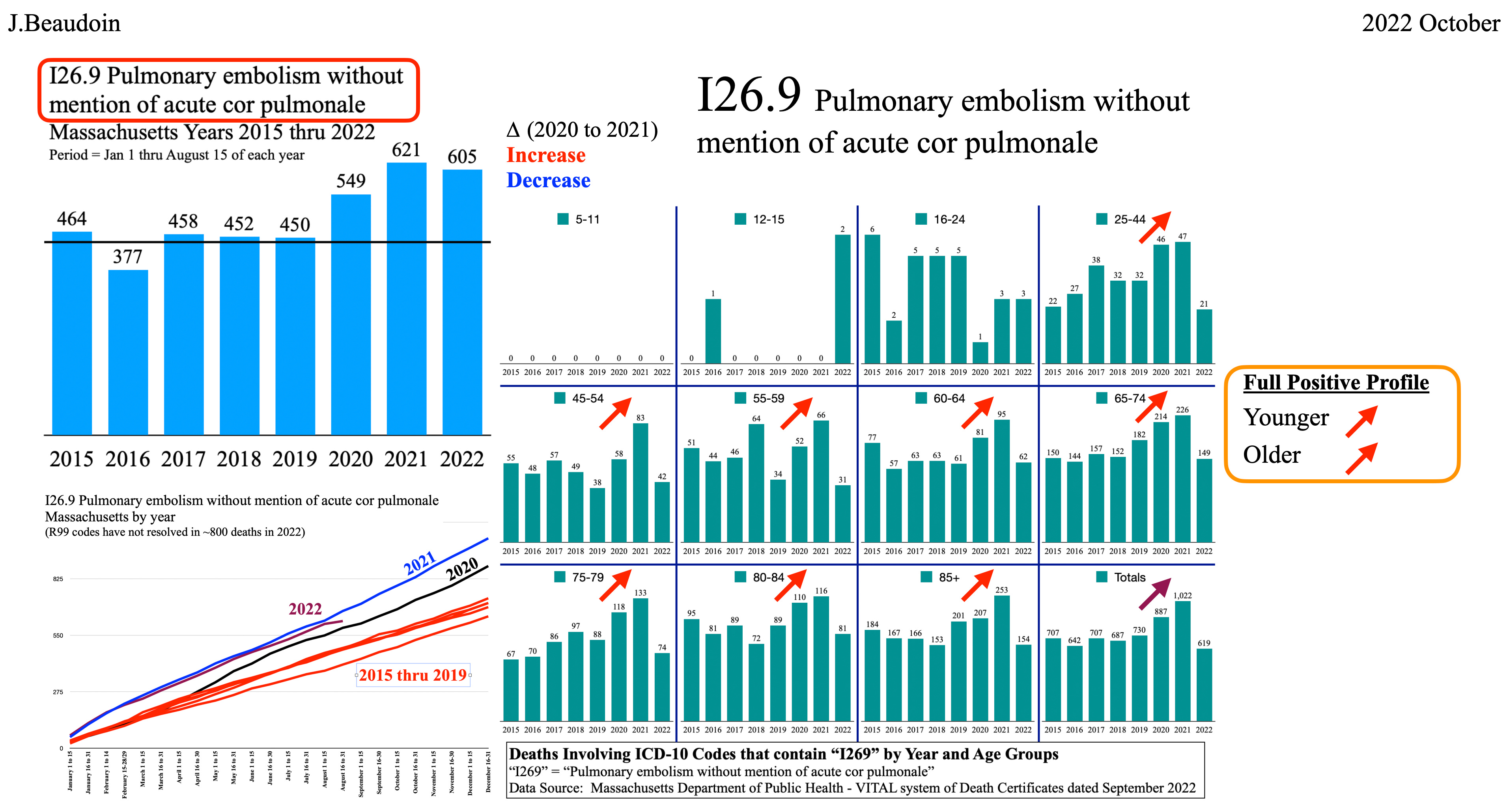
Pulmonary embolism without mention of acute cor pulmonale (I26.9), aka, “PE”
Green right age group bar graphs are a FULL POSITIVE PROFILE. Every age group is UP, and while all-cause, covid, respiratory, and pneumonia are DOWN year over year 2020 to 2021 for half the age groups and in total. The I26.9 PE cause of death is, thus, inversely related to covid. Covid is likely NOT at all associated with increased PE’s.
The royal blue bar graph and the line graph below it both went UP significantly from 2020 to 2021. id est, while totals from all-cause, covid, and respiratory went DOWN and the difference between normal and 2020 was cut in half, PE’s went UP substantially.
This is NOT correlative. Something other than covid caused an excess of ~430 deaths from PE in the past 18 months in Massachusetts alone. That’s a lot of people and considering they’re younger, not like the 80yo covid deaths, that’s a lot of family destruction, too.

Cardiac arrest, unspecified (I46.9)
Green age group bar graphs to the right are in FULL POSITIVE PROFILE with only the 85+yo age group going DOWN a wee bit year over year 2020 to 2021.
Again, all-cause, covid, and respiratory went down substantially year over year 2020 to 2021, but cardiac arrest is UP in almost every age group. Inverse relationship.
The left graphs also show an issue, and 2022 shows no slow down. Cardiac arrests are up substantially in both 2021 and 2022. Something other than covid caused an excess of ~2,700 deaths from Cardiac arrest in the past 18 months.
NOTE: The tail end of every 2022 line appears to turn down. This is simply an artifact of the most recent data not being complete. Many of the medical examiners simply have not completed the death certificates for the most recent deaths. Please disregard that last data point and determine trajectory from prior semimonthly data points.

Cardiac arrhythmia, unspecified (I49.9)
Again, green age group bar graphs to the right are in FULL POSITIVE PROFILE with only the 85+yo age group going DOWN a bit year over year 2020 to 2021.
Again, all-cause, covid, and respiratory went down substantially year over year 2020 to 2021, but cardiac arrhythmia is UP in almost every age group.
The left graphs also depict greater arrhythmia deaths since “vaccination” with no slow down in 2022. Something other than covid caused an excess of ~340 deaths from Cardiac arrhythmia in the past 18 months.

Diseases of veins, lymphatic vessels and lymph nodes, not elsewhere classified (“I8” Codes)
This is a medium-sized bundle of codes that pertain to blood vessels and lymph nodes, which clean tissue and blood. After this category will be yet a smaller bundle.
The green bars are a POSITIVE PROFILE, not fully positive because both 80-84 and 85+yo go DOWN year over year 2020 to 2021. Given that those age groups were DOWN and usually comprise the most deaths, one might expect the totals to be DOWN. However, the totals are UP. That is indicative of younger people dying from clots and other issues in the veins and lymph nodes.
The royal blue bar graph and line graph both depict greater numbers of death in 2021 and worse in 2022 versus the covid year of 2020. This is a public health crisis. Covid deaths, being nearly double in 2020 compared to 2021, yields no correlation to these massive numbers of clot deaths.
Next will be a more specific and smaller bundle.

Other venous embolism and thrombosis (“I82” Codes)
This finer grain bundle is interesting because it shows the value of multiple viewpoints across time, totals, and age groups.
The age groups PROFILE is CONFUSED. There is nothing to tell from it.
However, the royal blue and line graphs depict 2022 as a major issue. What can possibly be causing such an increase in deaths from clots?
Substack just gave me an automatic message that this article is running out of room. So, do you want me to push forward with the “D” Codes or write another article? Do you want “I” and “D” Codes in this one article for reference or do you want to have to bounce back and forth between two articles?
I heard you. I will curtail my commentary and put “D” Codes below. Thank you for your input.

Benign neoplasms, Neoplasms of uncertain or unknown behaviour, Diseases of the blood and blood-forming organs and certain disorders involving the immune mechanism (“D” Codes)
This is another example of the challenges of finding hidden signals using different viewpoints. Clearly there is a POSITIVE PROFILE in age groups with only 25-44 going DOWN year over year 2020 to 2021, and only by one death.
Both royal blue and line graphs also show a clear signal. Usually the bundles obscure signals that can be found in the individual codes.
In a few individual codes within this group, you will below see clear signals, with CONFUSED PROFILES. That does not mean the absence of a signal. It may only mean that there is no AGE SPECTRUM PROFILE for deaths from these individual causes. It is not only old people dying from these causes. Age may not matter for what is taking the excess lives in these causes of death. The blood has not been right in our populous since the beginning of 2021.

Certain disorders involving the immune mechanism (“D8” Codes)
This ICD-10 code bundle pertains to certain immuno-deficiencies of the blood such as low T or B cells, low IgA or IgG or IgM, or various types of sarcoidoses.
Notice the CONFUSED PROFILE on the right green bar graphs of age groups. Older groups and the group of totals depict a signal though.
Now look at the royal blue and line graphs. These tell a story of excess deaths since the “vaccine.” The numbers are UP substantially from 2015-2020. There is something clearly killing more people in the blood since the beginning of 2021.

Acute posthaemorrhagic anemia (D62)
Acute means sudden, anemia means low hemoglobin, post means after, and hemorrhage means blood loss. So, this is low hemoglobin after a sudden loss of blood. In prior CdC articles, there were documented deaths from internal bleeding and hemorrhages. If there was anemia thereafter, then this code may be listed on the death certificate.
FULL POSITIVE PROFILE. Every age group is UP. The royal blue and line graphs are very high. If this was covid related, then 2020 would be UP. It is not. Thus, something else, beginning in 2021, is causing this blood issue.

Disseminated intravascular coagulation (D65)
Clots all over the body. How many of us never heard of this before covid? Include me on that list. This is one that may be caused by covid itself and then also caused by the “vaccine” albeit in higher numbers. Regardless of the cause, the numbers are UP substantially in 2021 and 2022 and UP a little less in 2020, but still more than 2015-2019.
This is a blood issue. There appears to be no age component to it. If one is susceptible, then it may happen. Perhaps, to reduce chances of it happening, stay away from whatever people did beginning in January 2021.
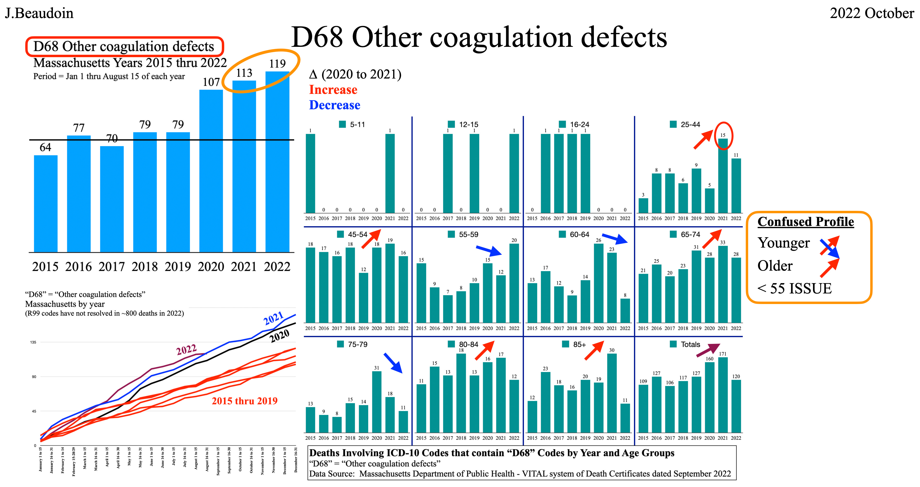
Other coagulation defects (D68)
Clotting defects in the blood. CONFUSED PROFILE means that there may not be an age component to this profile.
However, there is clearly an issue beginning in the year of covid 2020 and then going UP in 2021 and UP again in 2022. This is inversely correlative to the covid deaths and all-cause deaths. D68 has a positive correlation to the “vaccine.”

Secondary thrombocytopenia (D69.5)
Whenever you see “secondary,” it means that the source of the issue originated from something else. “Secondary” is used in cancer diagnoses because the cancer may have originated in another part of the body.
Imagine if someone has clots. The doctors are going to prescribe something like heparin. Either 1) too much heparin given to a person or 2) heparin given to a person whose blood system is dysregulated due to some other medicine or injection (hint: this crazy “vaccine”), can induce thrombocytopenia. Thus, thrombocytopenia, thinking while typing, can result 1) directly from the “vaccine,” or 2) from heparin given in response to covid-induced clots, or 3) from heparin given in response to “vaccine”-induced clots (I believe covid “vaccine”-induced clots occur about 100 times more than covid clots, but that’s just my belief).
CONFUSED PROFILE. No age component it seems.
2022 is out of control. Something is very wrong here despite the low overall numbers.
The blood is a mess.

Tachycardia, unspecified (R00.0)
Even though this is an “R” code, it has to do with the heart, which is the center of the circulatory system. It is relevant.
Clearly, there is a FULL POSITIVE PROFILE in all age groups, increasing totals every year since covid began, and continually increasing slopes since covid began, despite all-cause, covid, and respiratory going DOWN. Everyone probably knows someone who had a fast heartbeat from the “vaccine.” Why would anyone take something knowing that it somehow chemically or biologically induces a fast heartbeat more than anything they’ve ever taken before?
Conclusion
It’s all about the blood. Deaths from blood, blood forming organs, blood cleaning organs, blood transport system (circulatory system including the heart), and blood-related cancers are all exceptionally higher since the “vaccine.”
Diseases and reactions to drugs almost always have specific symptoms. What happened in 2020, 2021, and 2022 is depicted in C, J, and I codes. The patterns, including SYMPTOM SPECTRUM PROFILE and AGE SPECTRUM PROFILE, are very different between 2020 and 2021 and are very similar between 2021 and 2022.
The mechanism of action at the cellular level regarding covid and regarding the “vaccine” will not be fully known for years. There are theories on both sides of the issue. But we do not have time to debate “the science” while people are dying en masse from blood-related ailments. The safest thing to do is to stop this “vaccine” now and study the data. The “vaccine” clearly is not preventing any deaths from covid. The data herein shows that. And the “vaccine” clearly is correlative of thousands of excess deaths in Massachusetts alone over the past 18 months. A simple correlation between two (2) state databases will give us the answer.
Let me into any state’s data under NDA and I will provide an answer in one week whether these “vaccines” are safe and effective or unsafe and defective. My conclusion will not be based on scientific cellular level theory and competing expert witnesses. My conclusion will be based on hard evidence of actual people who died after onset of symptoms in minutes and death in days. EXHIBIT F is overwhelming and beyond reasonable doubt. Go to EXHIBIT F and read about real people and families torn apart by these “vaccines.”
Typo "in 2021 and 2022 from what killed in 2021" --> "in 2021 and 2022 from what killed in 2020"
The only other thing that comes to mind when I read this is how recording "death" must be such a.bunch of BS at times. Maybe not all the time. I am a PT. The ICD10 coding system is as detailed as you in theory this knit could be, like fall off a scooter, while eating ice cream in a.snow sorry on a Tuesday and you have knee pain....to the fact that sometimes there is a code for laterality in a body part that you have a right and left! So it makes me shake my head with such variety in options in coding and whatever confusion or uncertainty that comes out of this system. Thanks for bringing this data at such level detail forward.