


Vermont All-cause signal analysis
Begin Vermont analyses

Again, a big thank you to substack author Ashmedai, who requested and received the data from the State of Vermont; and provided it to me. He has his own substack and is also writing about the Vermont data. Ashmedai’s first Vermont article can be found here and is titled - “Vermont's Post-Pandemic Mortality Apocalypse” and subtitled - “Analysis of Vermont Death Certificates Reveals Stunning Excess Mortality Increases from a Variety of Conditions in 2021 & 2022 - including COVID - but not so much in 2020”
The newly acquired Vermont death certificates are examined herein. This article will be short in order to plant some thoughts in your minds before I can get to more in-depth analyses.
Vermont is very different from Massachusetts even though the states border each other. Vermont (VT) has about 640,000 people whereas Massachusetts (MA) has about 6.9 million. Thus, MA is more than 10X the size of Vermont in population.
Vermont is rural, while much of the population of MA is urban and suburban.
In my opinion, MA is likely the most fraudulent COVID-19 data state in the nation. The fraud is outlined in prior articles that describe my lawsuit against the state for fraud on death certificates.
It is probably a little more difficult to commit such levels of fraud and elder care neglect in a state as small as VT. Thus, you will not see the big first wave in VT that was seen in MA. Vermont probably still has the fewest covid deaths per population of any state in the United States of America.
However, there is a significant signal on first inspection and it looks absolutely nothing like a seasonal respiratory virus. It seems by the data pattern that something else, NOT-covid, is killing a significant excess of people in 2021 and 2022 in Vermont. Let’s take a look.
Adding normal to anomaly
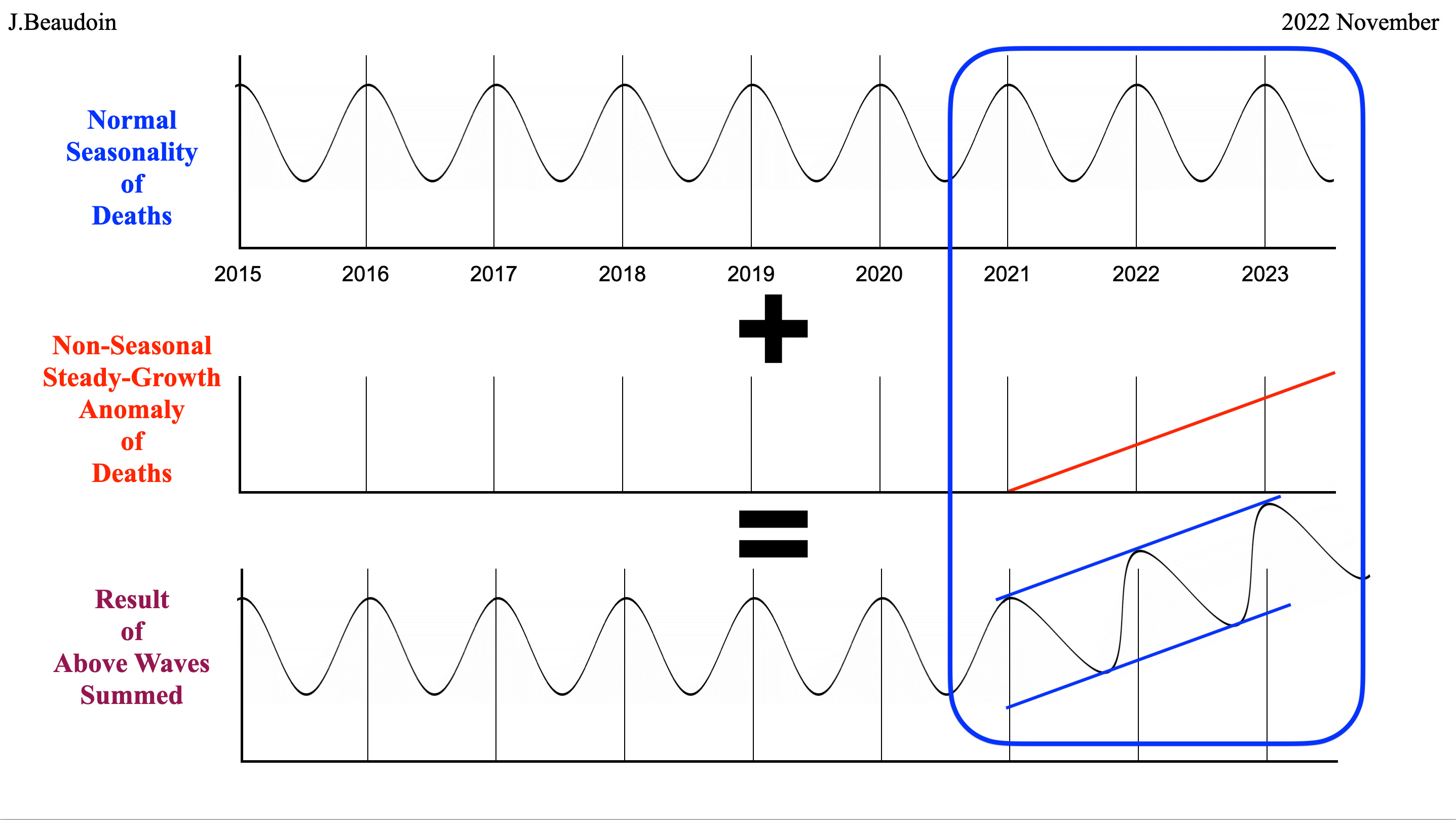
In the graph above, the sine wave in the first row above is what normal seasonality of deaths looks like in a four season climate such as VT. If some anomaly comes along that causes death and it grows over time linearly, like the red line in the second row of graphs, then what results looks like the third row of graphs. The blue lines are just to visualize the black wave in this graph. The sine wave has turned upward with a center on the same line as the red line above. Simple enough, right?

In the graph above, again the first row is a standard seasonal yearly cycle of deaths. The second row, however, is what a seasonal virus looks like. It is bad in the winter and disappears in the summer like influenza and coronaviruses. Each year is a diminishing first derivative of a Gompertz curve.
COVID-19 was determined to be a seasonal respiratory virus by most accounts and by the MA death certificate data. Adding the novel seasonal respiratory virus in the second row to the normal annual deaths curve in the first row yields the third row, which is a higher amplitude sine-ish wave in the novel year, diminishing each year thereafter toward the normal amplitude of the sine wave in the first row.
Notice the summed wave is red in the third row and the blue lines are again simply there for visualization. Sometimes it takes one year and sometimes it takes two to three years for the novel virus to become endemic and fizzle out to normal.
Let’s look at what actually happened in VT and see if it resembles a seasonal respiratory virus or some steady growth anomaly without any seasonality. If you’ve read my prior articles then you know that I classify diseases as having a symptom spectrum profile, an age spectrum profile, and a seasonality profile. This article only depicts the seasonality profile. Subsequent articles will dive into the individual causes of death and the age strata for each cause.

The above graph is the actual deaths for VT each year. Notice the sine wave seasonality for each year with the peaks occurring in the winter at the turnover of a year. Most waves touch the top and bottom, but some do not.
Again VT borders MA, which was 3rd worst in USA for the first year or two of covid.
Notice the 2018/2019 VT winter, which falls very short of the normal peak, thus leaving much dry tinder around for a year or two. The first VT wave of the purported covid disease does touch the same peak, though a month or two late, that occurs in most of the prior five years. There is no excess difference. However, the low point in the summer of 2020 falls short of the normal five-year bottom. That may be covid or it may be the dry tinder that was left over.
View now the fall and winter of 2020/2021, which peaked slightly above the normal band of red lines.
Vaccination began in early 2021 in VT and VT quickly became one of, if not the most vaccinated states in the USA, far above normal, but only a little above MA, which is around fourth highest in USA.
The summer of 2021 experienced even higher excess than 2020 and then the winter of 2021/2022 was outrageously high and began several months earlier. And the summer of 2022 is also outrageously high. Something bent the sine wave up in almost a perfect line with positive slope like the first set of graphs in this article.
Vermont is NOT experiencing a respiratory virus pandemic, but they are experiencing very much excess death for some reason. Of course, a look at respiratory versus blood related causes of death may yield the answer as to the cause of all this excess death.
Conclusion
There are no numbers discussed in this article. This is about pattern recognition and whether the VT deaths are acting like a respiratory virus in seasonality profile or the VT excess deaths resemble something else like linear and steady growth.
Clearly, the graph of actual VT deaths appears to be nothing like a seasonal respiratory virus. In fact, it is inversely related because covid comes in hard and then diminishes like any other respiratory virus, while the actual VT graph resembles some other introduced linear externality … like the vaccine.
Thank you for reading this short article. I hope it frames the subsequent discussions, which will be more about symptom spectrum profiles and age spectrum profiles.
John 14:6
Jesus answered, “I am the way and the truth and the life. No one comes to the father except through me.” I love and miss my son, John, and hope that I can live up to being like him. I never cared about academia or improving myself in the humanities such as philosophy or economics. I was an engineer and had a career in sales. John turned down acceptance to the school of engineering at UMASS and reapplied later to the school of philosophy. Since he left this life, I’ve grown as a person to learn some philosophy and economics and law like John would have learned by now. I know that I will never be able to read as fast as he did or think like he did. But learning helps remember and honor him in my own way. And I hope that my data research and lawsuit can save others from losing their children. These vaccinations must be stopped and the oligarchs culling our elderly and our youth should be offered a path to their final destination. My objective is to arrive at a different final destination, God willing.
I am truly sorry to hear about your son, John. We will be in a better place one day. We know where we are going. You are in my thoughts and prayers.
“He healeth the broken in heart, and bindeth up their wounds.” (Psalms 147:3)
I am so sorry for the loss of your dear beloved son. Thank you, thank you for all you are doing to bring truth to light. God bless you.